This space is my sandbox—a repository of half-baked ideas, late-night sprints, and design explorations. This is a collection of those stories. Some have happy endings, some are still being written, and others… well, they live here as reminders of ideas that didn’t quite work (yet). Welcome to my evolving notebook of experiments, thoughts, and creative misadventures.
Pixel to perfection. Each pixel matters yet only makes sense within the whole—embodying how effective research balances granular findings with comprehensive vision.
Gateway to the Fluttering Sages. Cross into the world of fluttering sages, buzzing with words of wisdom. Greet them with kindness (tap), and they’ll share their timeless wisdom—words of insight carried on the breeze from an ancient, unseen world. (Few of my favourites)
ARKWATCH. Built a defense-grade drone monitoring platform. Core features include a real-time dashboard, interactive map layers, advanced alert management, data analytics, drone control, and role-based user management—ensuring swift, clear situational awareness and response. Built it on a custom prompted design system.
Pixel art canvas. The idea came from thinking about how to transform passive consumption into meaningful engagement for the viewers. The pixel canvas uses cognitive reward pathways to turn transient visitors into engaged participants through meaningful micro-experiences.
Welcome to my little visual design playground (personal, client, and some more). You’ll find everything from branding revamps to packaging designs. Anyway, this spot is the catchall for all my visual experiments, late-night mockups, and the occasional wild idea that actually made it out of my sketchbook.

Byondpix. The idea came from when I was working on my branding. I thought there had to be a typeface out there that matched my logo—but to my surprise, there wasn’t anything quite right. So, I decided to build my own. It’s an all-uppercase font, simple and clean, and I’m sharing it for free on FontStruct.

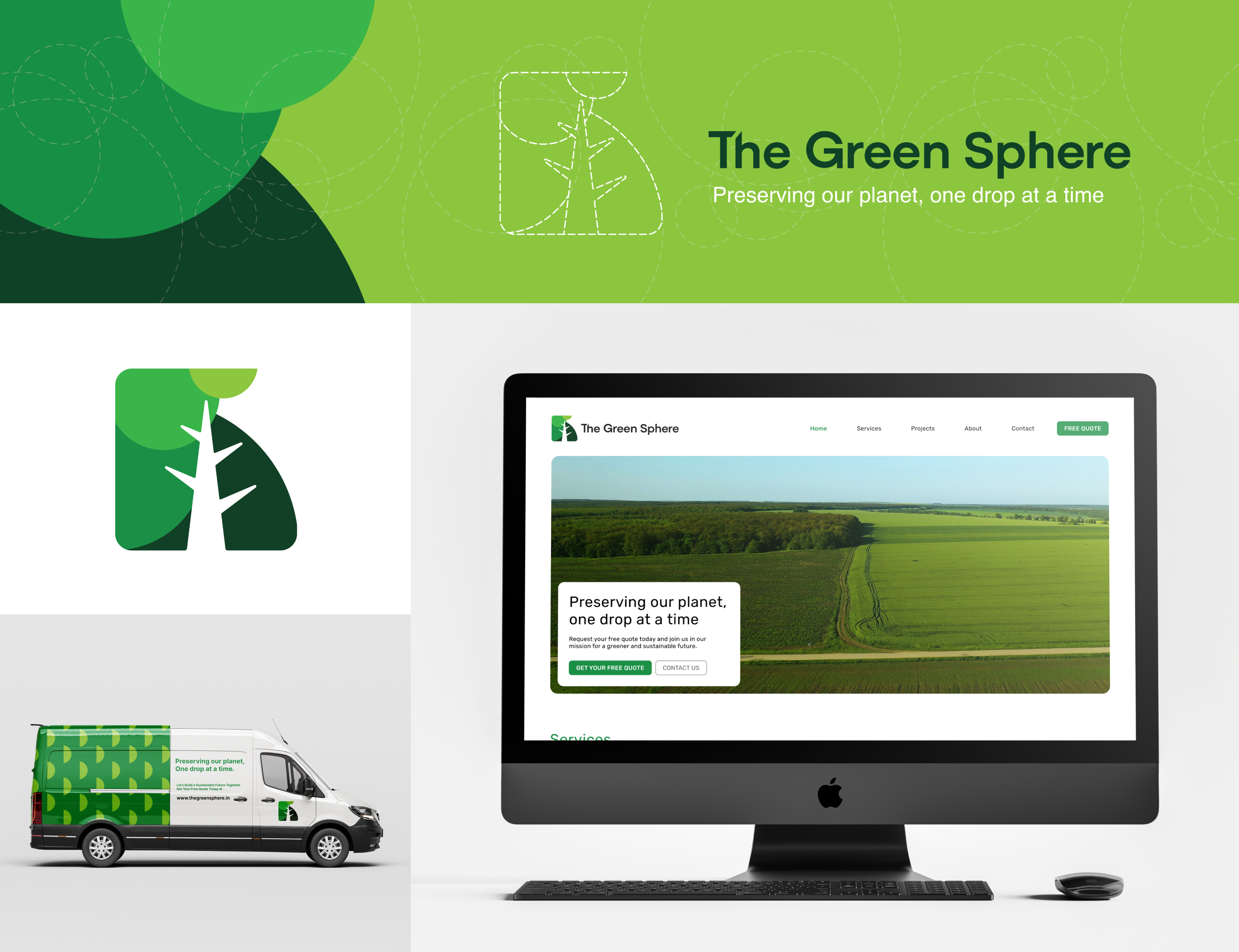
The Green Sphere. Worked closely with a client to develop their brand strategy and design their visual identity.
.png)
Rangers FC. It's one of the oldest clubs in football history. Which pulled me in to bring a modern spin to their branding while preserving their rich legacy.

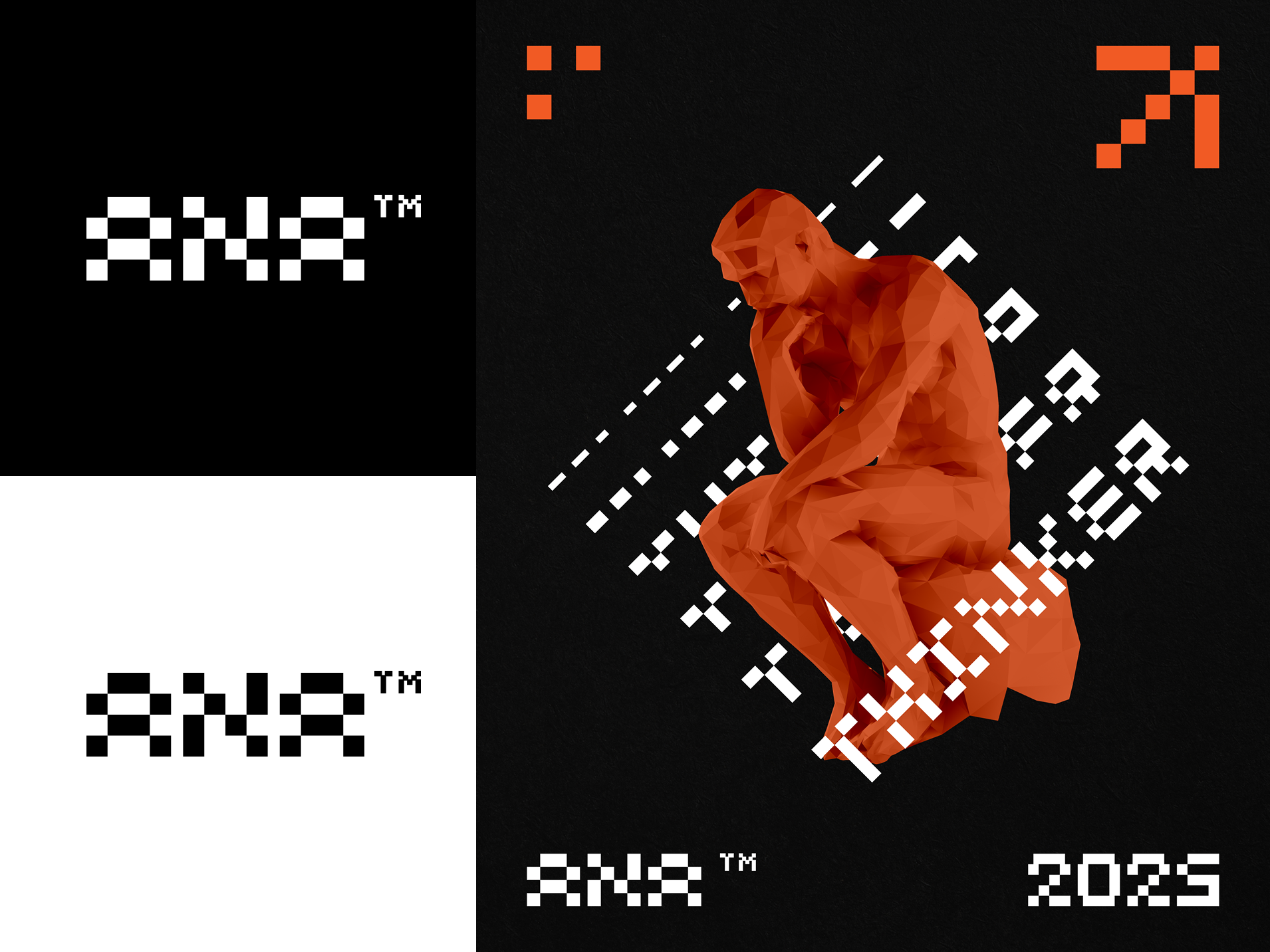
ANA ™. Personal branding as a designer is tough—you're never truly satisfied. I've always believed that less is more, and I tried a variety of flat black and white designs and wordmarks until finding the one that really worked. It was balanced and represented my approach and thinking as a designer.

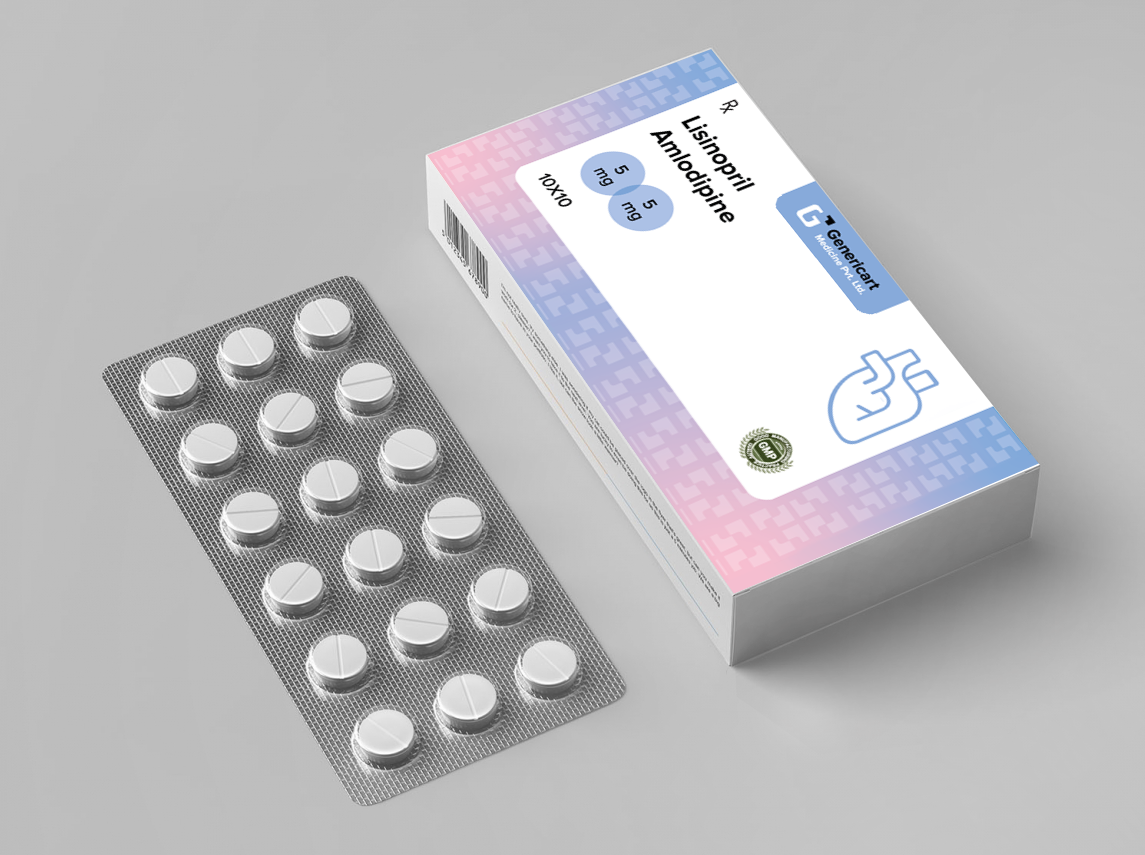
Genericart Packaging. Led the packaging for one of the biggest IDE clients as we worked on creating a comprehensive and sustainable packaging design system for a pharmaceutical firm that had roughly 300+ distinct drugs with varying specs and classifications.
.png)
Ocean Enterprise. Led the rebranding for one of the IDE clients.

Copyright © 2025 Anamitra Jana
